It is very easy to embed Google Maps in your web pages. Go to a Google Maps website and zoom-in to an area that you want to embed. Now click on the Menu icon in the top right corner and choose the Embed Maps option from the menu.
The embedded map is non-responsive. What it means is if you open the page on a device other than your desktop computer, the Google Map won’t fit the screen and you’ll have to scroll the page horizontally to see the complete map.
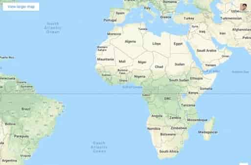
Embed Google Maps Responsively
Below is the default embed code for the new Google Maps:
<iframe src="https://www.google.com/maps/embed" height="450" frameborder="0" width="600" style="border:0"></iframe>
As specified in the height and width parameters of the embed code, the default height for medium embeds is 450px or 75% of the default width (600px).
If you wish to transform this static sized Google Map into one that is responsive, all you have to do is add a few CSS rules to your web page and wrap the embed IFRAME inside these rules.
The new responsive style for embed code will be something like this. You can change the value of padding-bottom from 75% to something for a different aspect ratio. You can set everything according to your requirement.
Below is the responsive embed code for the new Google Maps:
<style>
.google-maps {
            overflow: hidden;
            position: relative;
            height: 0;
            padding-bottom: 75%; // This is the aspect ratio
}
.google-maps iframe {
            top: 0;
            left: 0;
            position: absolute;
            height: 100% !important;
            width: 100% !important;
}
</style>

<div class="google-maps">
<iframe src="https://www.google.com/maps/embed" height="450" frameborder="0" width="600" style="border:0"></iframe>
</div>